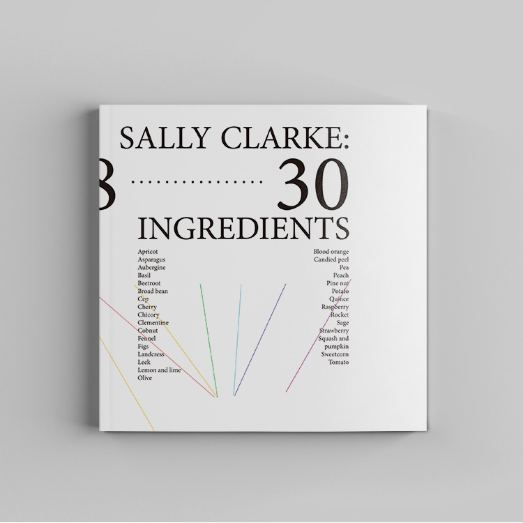
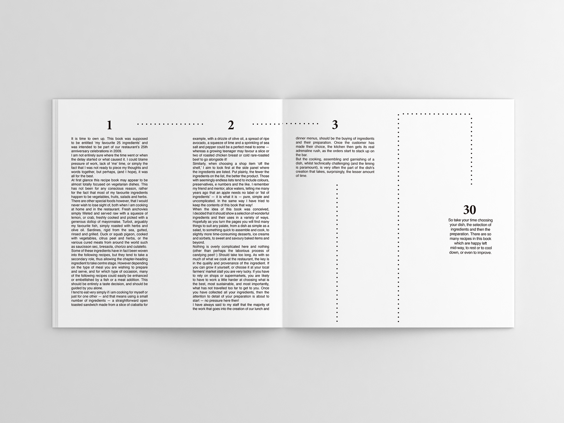
This design was my second year project. It was a cookbook design for Clarke: 30 Ingredients. The target audience is young ladies aged around 20-40.
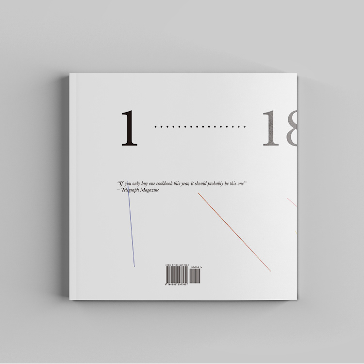
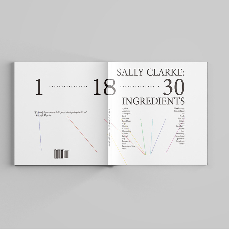
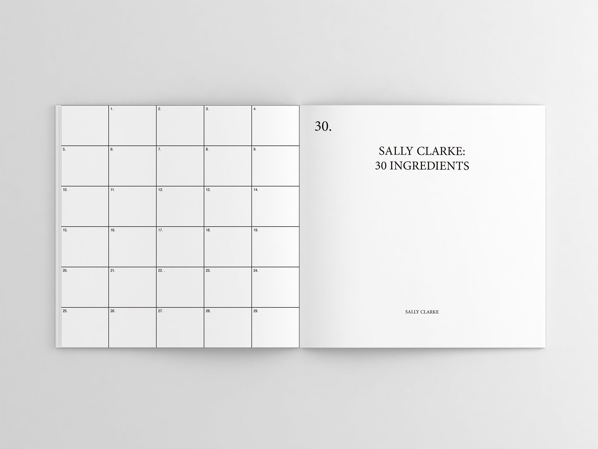
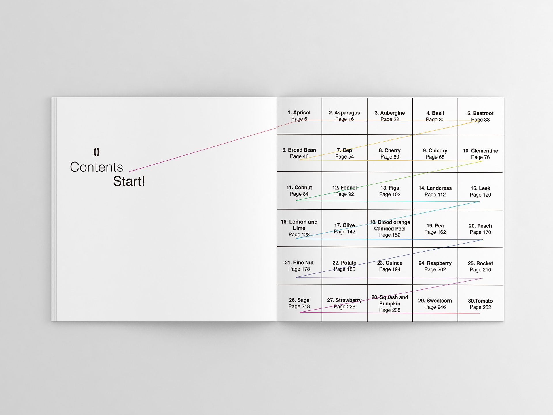
The Cover listed the ingredients. The design was inspired by Swiss design. There are 2 more ingredients listed on the left to balance the word ‘30’. The colour lines are pointing at the bottom of the cover. It looks like putting pasta into the bowl. I quoted Telegraph Magazine words:’ If you only buy one cookbook this year, it should probably be this one.’ on the back of the book.I want to keep the design in simple and clean. The endpaper layouts are related to the content pages. There are 30 blocks filled with 1-29 and the other pager is filled with the number 30 so it connected two pages.
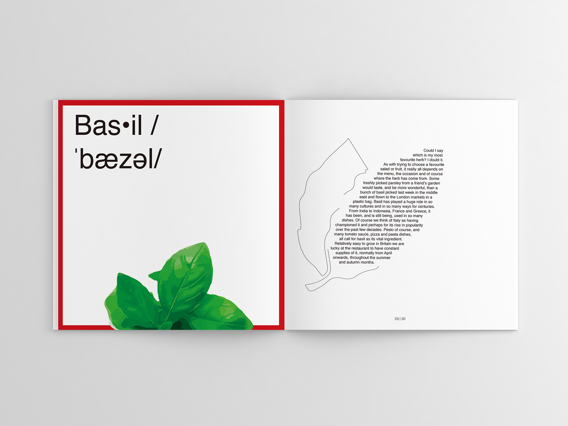
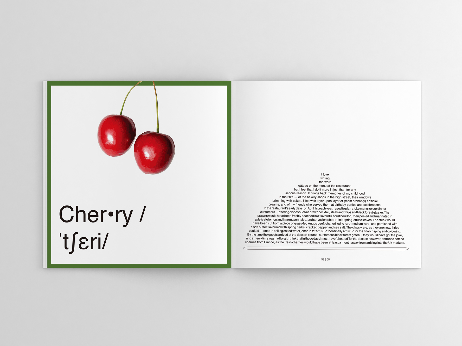
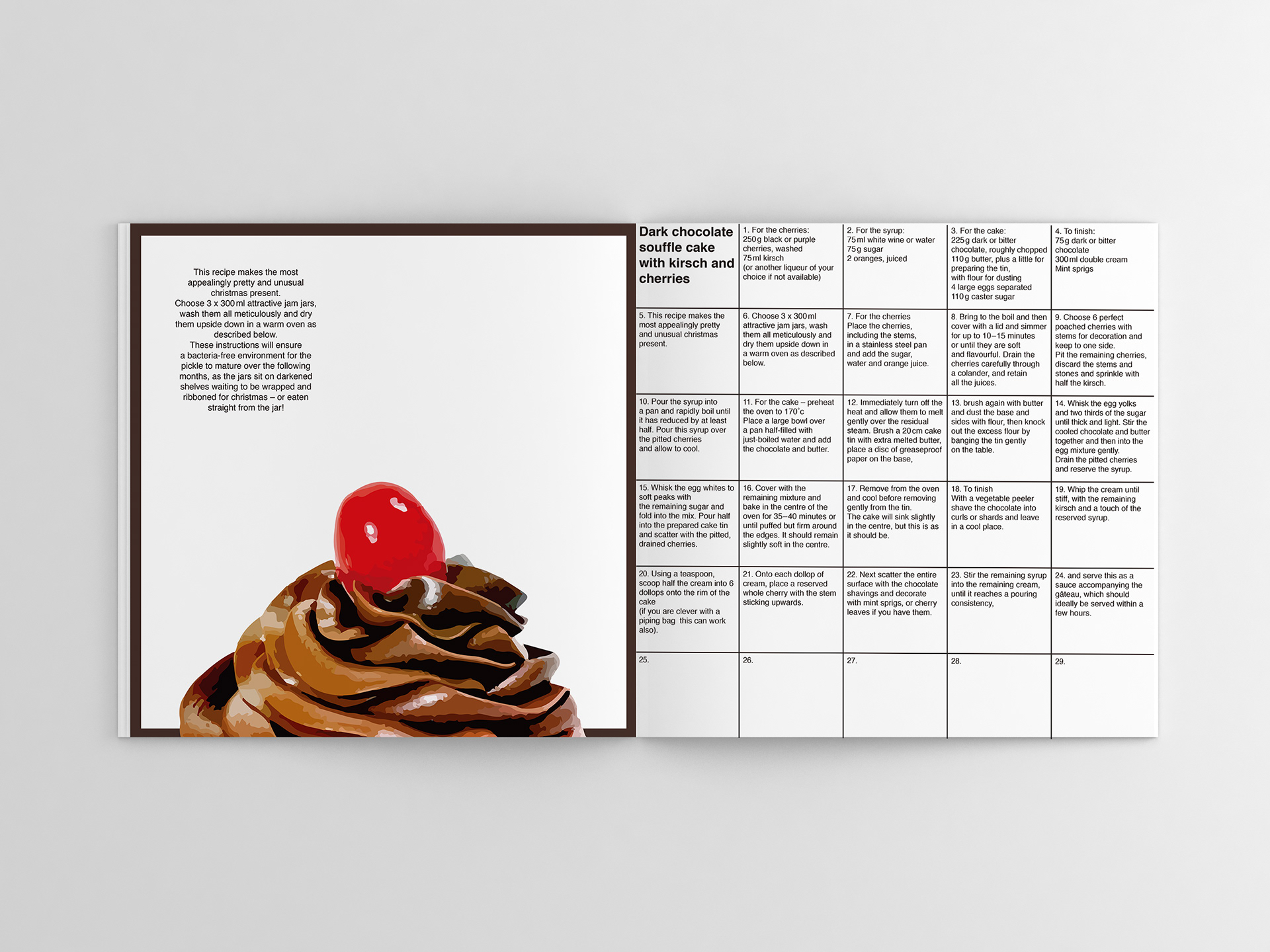
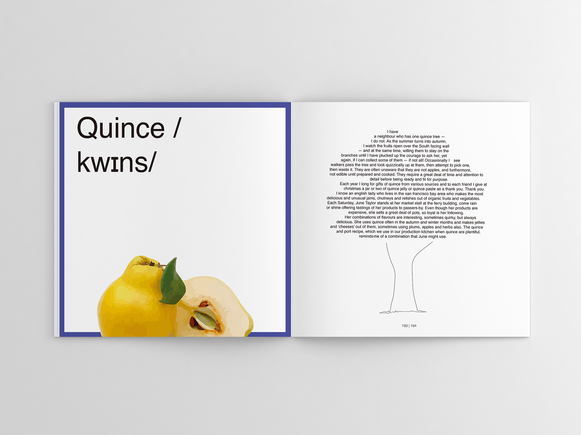
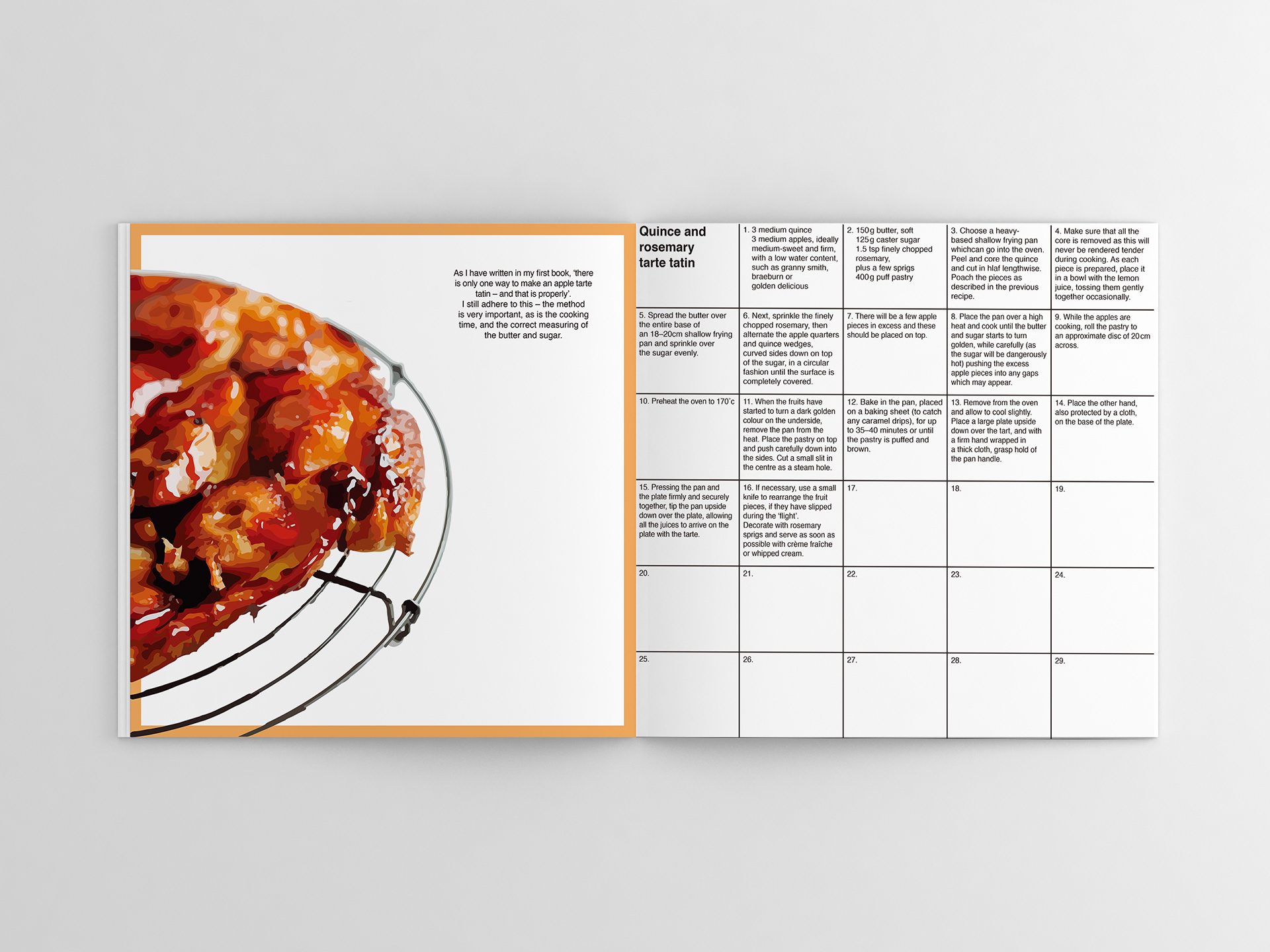
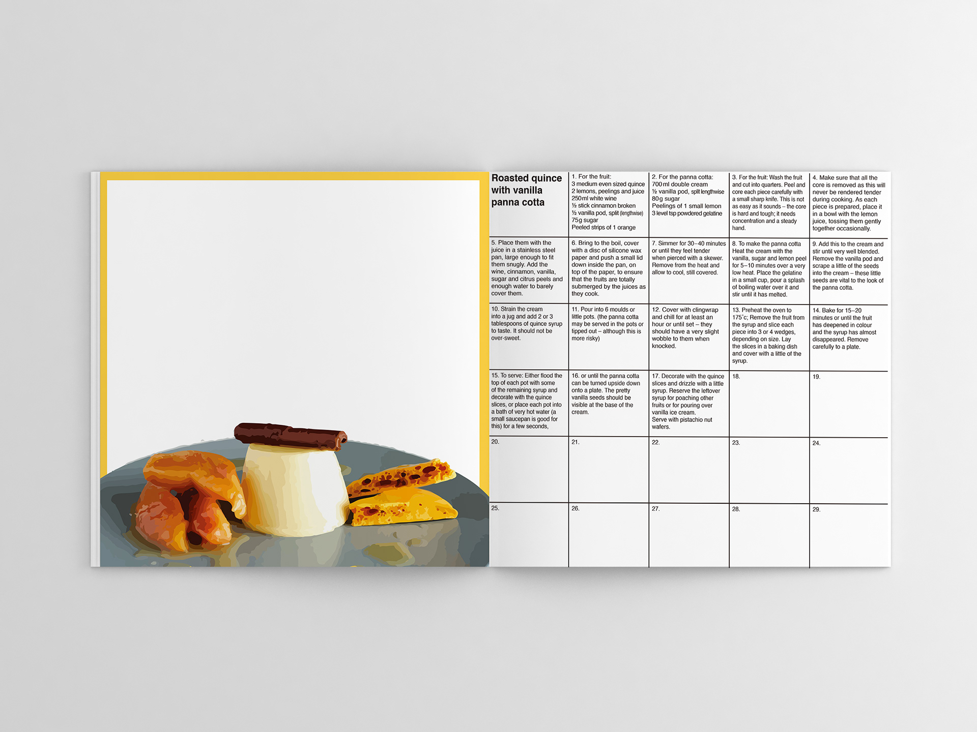
For the ingredients, Sally Clarke wrote short stories about her and the choosen ingredients. I followed the story content to design the textbox shape. For the pages about ingredient, the frame colour are complementary. For the pages about recipe, the frame colour are analogous. Since most of the complementary colour of the dishes such as blue may not make the reader think about food, the recipe pages frame are in analogous colour.
For the ingredients, Sally Clarke wrote short stories about her and the choosen ingredients. I followed the story content to design the textbox shape. For the pages about ingredient, the frame colour are complementary. For the pages about recipe, the frame colour are analogous. Since most of the complementary colour of the dishes such as blue may not make the reader think about food, the recipe pages frame are in analogous colour.